Why Mobile-First Design is No Longer Optional
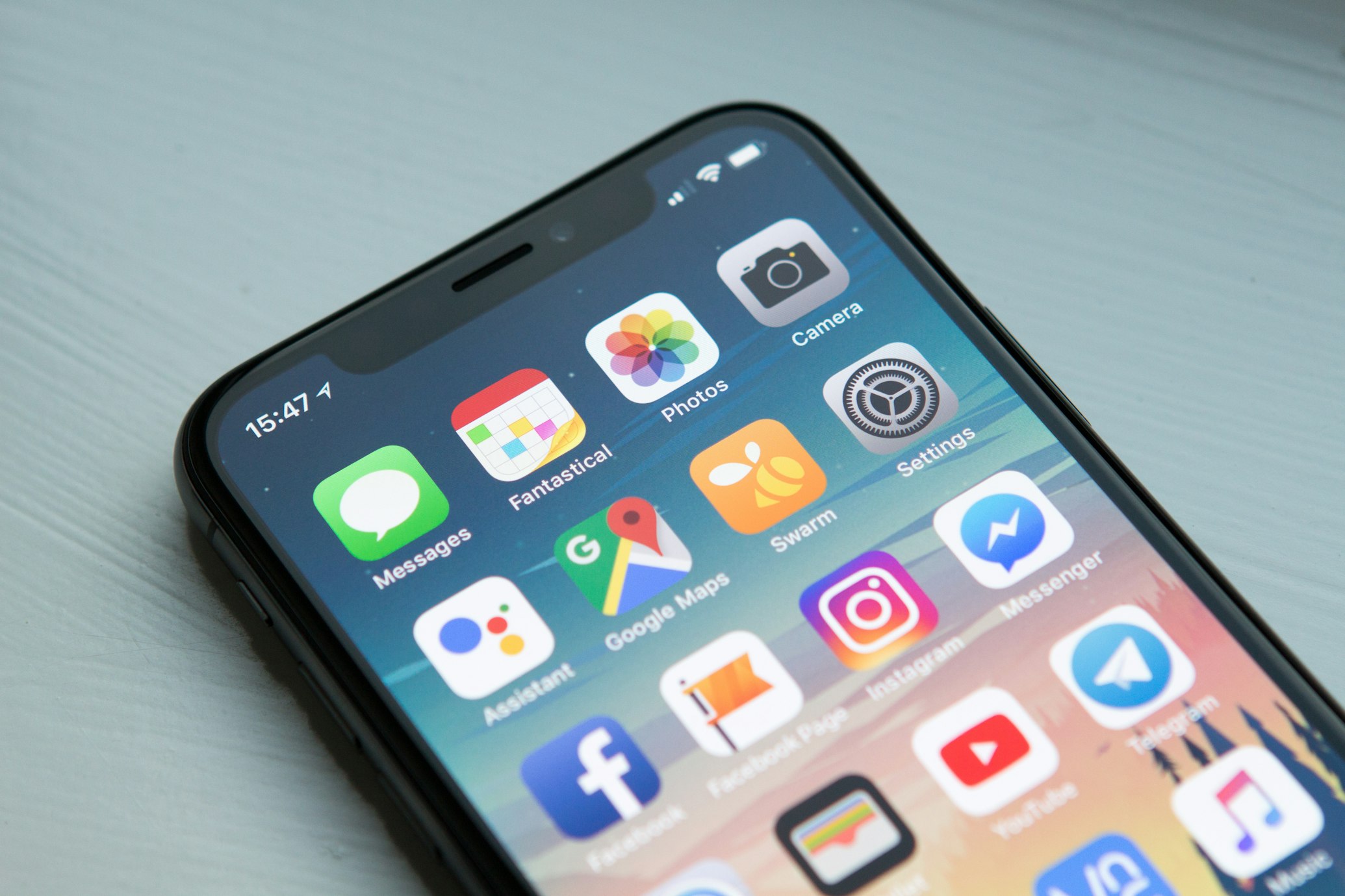
The statistics are clear: more than half of all web traffic worldwide now comes from mobile devices. If your website or application isn’t optimized for the small screen, you’re not just losing visitors—you’re losing revenue.
What is Mobile-First Design?
Mobile-first design is a design philosophy that starts the creative process by sketching or prototyping the mobile version of a site first, then expanding to larger screens. This approach forces you to prioritize the most important content and functionality, leading to a cleaner and more efficient user experience overall.
Why It Matters for Your Business
1. Improved SEO Rankings
Google has officially switched to mobile-first indexing. This means the search engine predominantly uses the mobile version of your content for indexing and ranking. A poor mobile experience will directly result in lower visibility on search results.
2. Faster Load Times
Mobile users are often on the go and using cellular data. Designing for mobile first encourages the use of optimized images, efficient code, and minimal bloat, resulting in lightning-fast load times across all devices.
3. Better Conversion Rates
A seamless mobile experience reduces friction in the customer journey. When users can easily find what they need and complete actions (like making a purchase or filling out a form) on their phones, your conversion rates will naturally climb.
Beyond “Responsive”
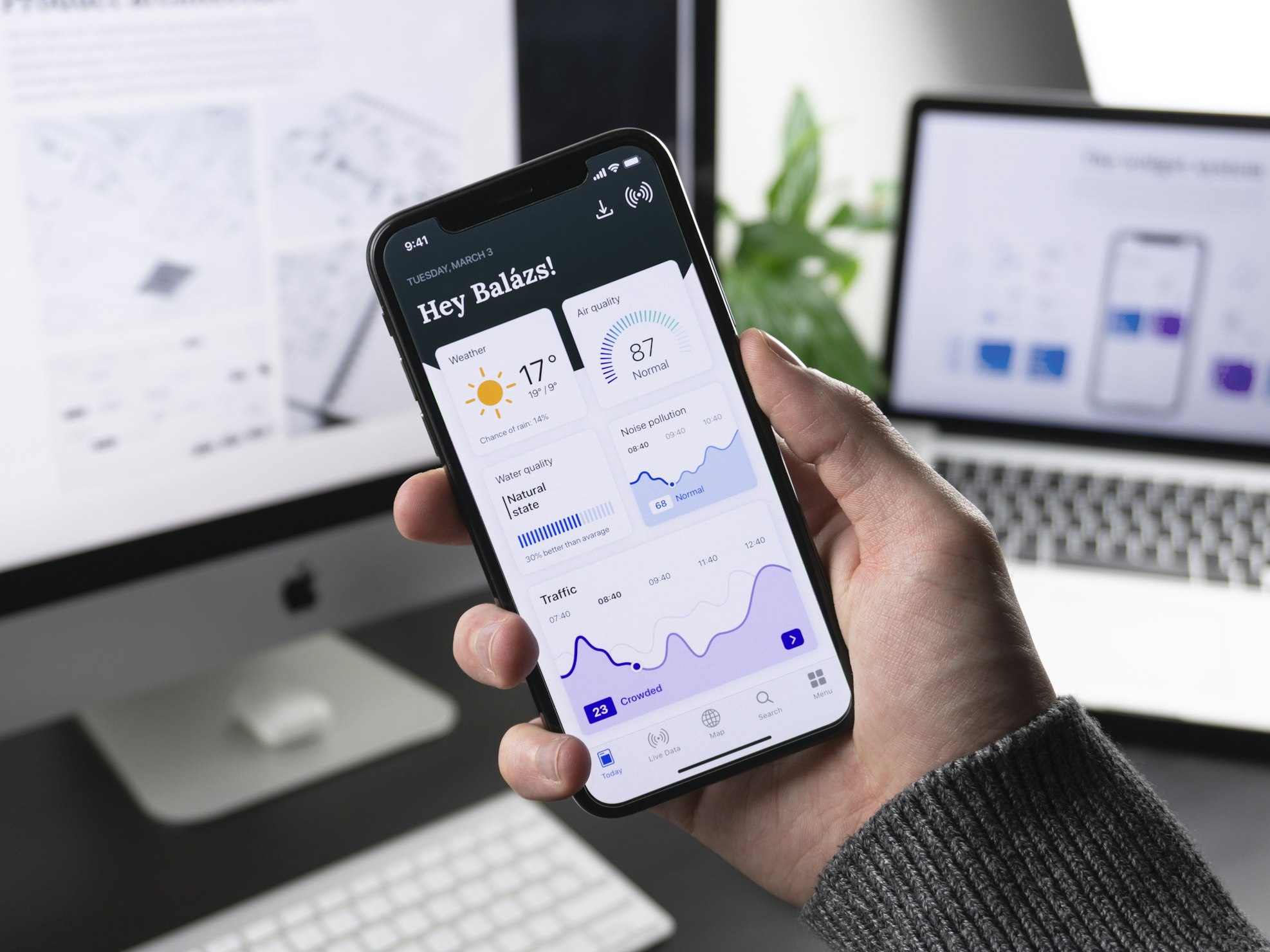
Being “responsive” isn’t enough anymore. You need to consider mobile-native patterns: thumb-friendly navigation, touch targets of appropriate size, and the elimination of hover-dependent interactions. Your web app should feel as natural as a native mobile application.
Conclusion
Mobile-first isn’t a trend; it’s the standard. By putting the mobile experience at the core of your digital strategy, you ensure that your business remains accessible, relevant, and profitable in an increasingly mobile world.
Is your current site ready for the mobile era? Let’s take a look together.